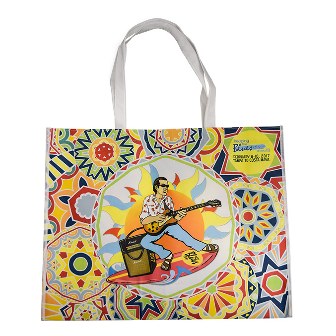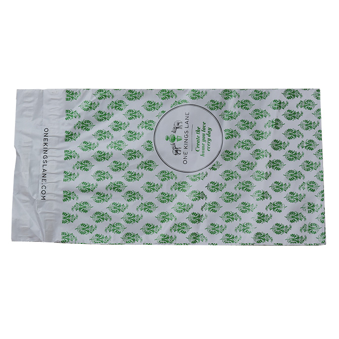

Pantone’s 2018 color experts have selected a list of expected swatches to be on trend for the upcoming year. Some hues we are seeing this year are so trendy, they are expected to carry over into the 2018 season. Regardless, it looks like there will be a trend everyone will love for their own brand and personal style.
From complimentary colors such as blues and oranges to deeper berry infused hues are expected to be seen everywhere from fashion and interiors to retail packaging, ecommerce supplies and accessories.
The versatile palettes these colors make up speak to the need for products or surroundings that are quirky, ethereal and sometimes unpredictable; a common trend we have seen in 2017 so far. To match the mood these hues create, Pantone has given them unique names such as Greenery: Pantone’s 2017 Color of the Year, Happy Yellow and Hearty Guacamole, to name a few.
To balance out the bold and brighter colors that are expected to be seen in 2018, a new set of neutrals with pops of deep reds and yellows are bursting onto the scene setting the tone for artful accents that can be complimented with trending colors and textures.
Its fun to keep up with current color trends. To make all of your packaging stand out, use pops of bold, bright, and even muted colors to create something that is unique to your brand. For an extra touch, mix and match these hues with different textures, custom treatments and embellishments to make your design pop. We are excited to see Pantone‘s colors of 2018 in stores, homes, and magazines.


