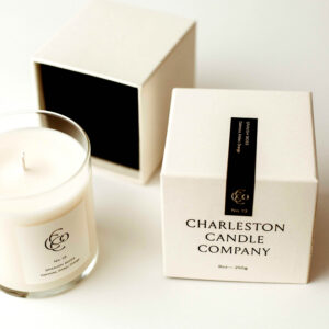
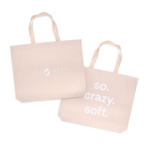
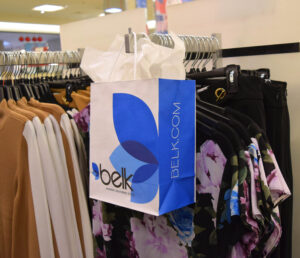
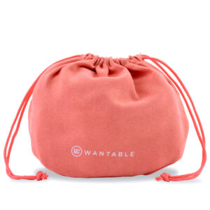

The impact of color palettes on packaging is significant and should never be underestimated. Previously, we discussed the 2024 Pantone Color of the Year being Peach Fuzz. Now, we’re here to introduce Pantone’s Mediterranean Summer color palette. This sets the stage for a revolution in inspirational summer packaging. Pantone’s Mediterranean Summer palette brings a fresh, vibrant aesthetic that captures the essence of Mediterranean shores. This palette, known for its bright and inviting hues, becomes a pivotal tool for brands aiming to invoke the warmth and allure of summer through their product packaging. Pantone’s Mediterranean palette colors are a strategic choice for brands looking to stand out in a crowded marketplace.
Overview of Pantone’s Mediterranean Summer Color Palette
We know the Pantone Color Institute for its influential color forecasting. Now, the color institute is unveiling a Mediterranean Summer color palette that captures the essence and vibrancy of the Mediterranean region. This palette represents the natural beauty and cultural vibrancy of the Mediterranean.
Inspiration Behind the Palette
Drawing from the diverse landscapes and the rich cultural tapestry of the Mediterranean, Pantone partnered with Nespresso to develop a color scheme that reflects the region’s dynamic spirit. The vivid hues found in the Mediterranean environment inspire Pantone’s newest trending palette. From the deep blues of the sea to the bright oranges of the citrus fruits. This collection, led by the vibrant ‘Mandarin Orange,’ celebrates the beauty, culture, and flavors of the Mediterranean. Making it an ideal choice for brands looking to infuse their packaging with a sense of summer fun and adventure.
Mediterranean Summer: Key Colors in the Palette
The palette features a mix of engaging and lively colors:
- Mandarin Orange: A luminous and fun-loving orange that ignites the desire for summer fun.
- Habanero Gold: A sunny yellow that brings joy and enthusiasm.
- Muskmelon: A light, fruity pastel that captures the easy-going spirit of summer.
- Aquarelle: A cool hue that reflects the aqua blue of the Mediterranean Sea.
- Blue Iolite: Representing the mesmerizing nighttime sky of the Mediterranean.
- Tofu: A warm, inviting beige that evokes the soft warmth of sandy beaches.
Impact of the Palette on Design Trends
This selection of colors not only appeals universally across industries but also maintains a timeless quality. Making these hues highly effective for commercial, fashion, and packaging environments. Brands and designers are using these colors in their summer packaging to convey optimism, comfort, and confidence. This trend is evident in the way these colors are being used to create a strong visual identity that resonates with consumers.
This palette serves as a foundational element for brands aiming to create a memorable and engaging consumer experience, leveraging the power of color to influence emotions and behaviors. The strategic use of these Mediterranean-inspired hues in packaging design is setting new trends and shaping the future of brand aesthetics in the consumer market.
Brands Leveraging Bright Colors for Summer-Inspired Packaging
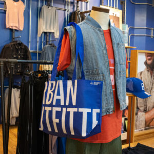
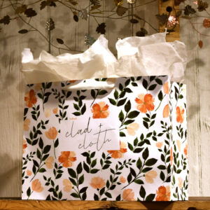
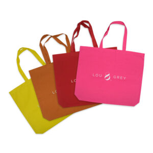
The summer season ignites a particular excitement among brands, prompting them to adopt strikingly bright colors that resonate with the warmth and joy of the season. This trend, significantly influenced by Pantone’s Mediterranean Summer color palette, has seen various brands creatively incorporating these lively hues into their packaging designs, aiming to capture the essence of summer and stand out on the shelves. Additionally, due to the bold and bright nature of these hues, this palette can easily transition from season to season. Therefore, your brand is always on trend.
Designing Summer Inspired Packaging with Pantone Colors
When considering the integration of Pantone’s Mediterranean Summer color palette into packaging design, it’s essential to approach the process with a blend of creativity and strategic planning. Here are some helpful and practical tips for using Pantone colors. Including key design elements to consider, and showcase case studies of effective summer packaging.
Practical Tips for Using Pantone Colors
- Identify Your Brand’s Message: Select a color palette that resonates with your brand’s identity and the emotions you wish to evoke in your consumers. Beige hues like Tofu, for example, are perfect for products emphasizing organic and natural qualities.
- Consider Color Psychology: Different shades convey different feelings and messages. Lighter shades of blue can instill trust and calmness, for instance. Ideal for health-related products, while bolder yellows and oranges suggest a wild, untamable quality. Suitable for products with natural ingredients.
- Maintain Color Consistency: Ensuring that the colors on the packaging match those you’ve selected is crucial for brand identity. It’s important to stay consistent when creating your packaging collection.
Design Elements to Consider
- Material Compatibility: First, understand how different packaging materials influence the appearance of colors. Utilizing Pantone’s tools can aid in visualizing color changes on common substrates, ensuring the final product meets expectations.
- Environmental Impact: Next, opt for packaging materials and inks that are environmentally friendly. This not only aligns with Pantone’s values of environmental consciousness but also appeals to eco-conscious consumers.
- Visual Hierarchy: Then, use color to create a focal point and guide the consumer’s eye. Strategic color placement can highlight key information or product benefits.
Future Trends in Mediterranean Summer-Inspired Packaging
The landscape of Mediterranean Summer-inspired packaging is ever-evolving. Additionally, new trends constantly emerging as brands strive to connect with consumers on a deeper level. One notable trend is the shift towards vibrant and refreshing color palettes that encapsulate the energy of summer. Brands are increasingly incorporating sunny yellows, juicy oranges, refreshing blues, and calming neutrals. Which not only attracts consumer attention but also enhances the overall appeal of the products. This strategy is particularly effective in food packaging, where the visual impact can significantly influence purchasing decisions.
Predictions and Insights
Industry experts predict that the future of packaging will continue to see a blend of innovation and sustainability. The trend towards minimalist packaging is gaining traction. Further appealing to the consumer’s preference for simplicity and eco-friendliness. This approach not only stands out on the shelves but also aligns with the increasing consumer demand for sustainable and eco-friendly packaging solutions. Additionally, the integration of technology in packaging, such as QR codes and digital elements that engage consumers, is set to expand.
Final Thoughts
In conclusion, embracing Pantone’s Mediterranean summer color palette and leveraging bright colors for summer-inspired packaging has proven to be more than a seasonal trend—it’s a strategic move that marks a brand’s dedication to innovation, relevance, and consumer engagement. Therefore, the thoughtful selection and application of these vibrant hues speak volumes, from capturing the essence of summer to evoking emotional connections with consumers. Moreover, as brands strive to stand out in a saturated market, the strategic use of color and design not only captures attention but also strengthens brand identity, proving that the right palette can indeed turn packaging into a compelling storytelling medium. Finally, the significance of these choices goes beyond aesthetic appeal, highlighting a brand’s commitment to trend awareness and consumer satisfaction.
Prime Line Packaging Can Help!
For businesses seeking to navigate these trends and carve out a distinctive space in the competitive landscape, collaboration with experienced partners can be the key to success. Prime Line Packaging stands ready to assist, offering expertise in custom packaging solutions that are not only visually captivating but also eco-friendly and aligned with the latest design trends. This partnership ensures that your brand’s packaging is not just an enclosure but an extension of your brand’s aesthetic, resonating with consumers and leaving a lasting impression.


