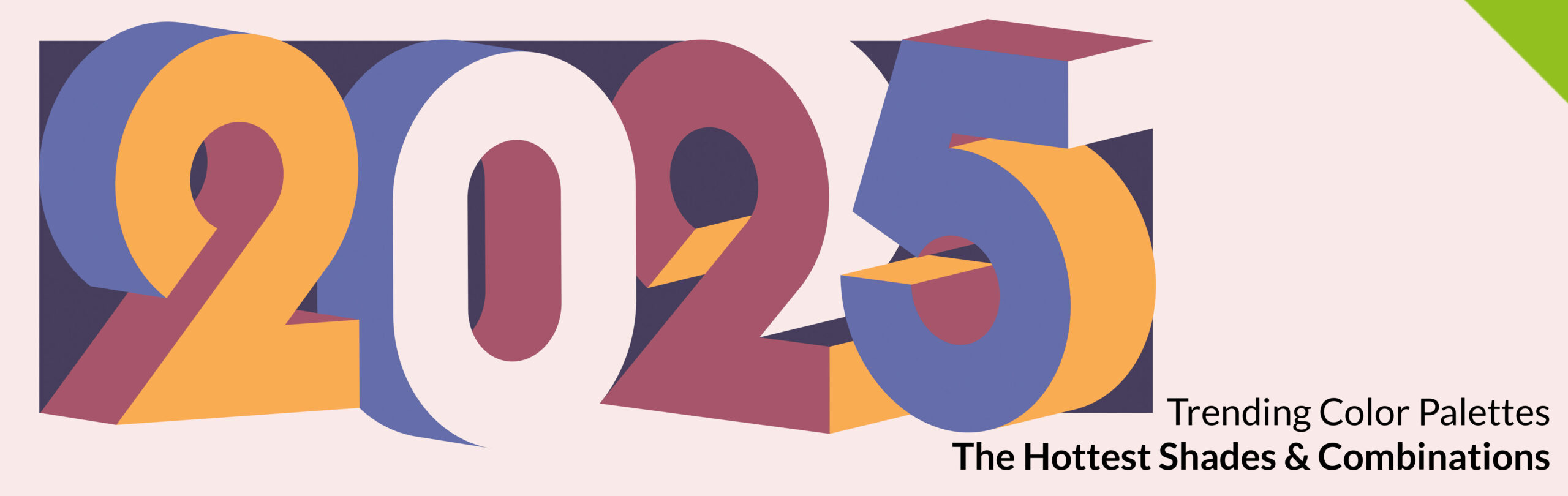
Color shapes moods. It sparks ideas. It’s the first thing people notice before they ever read a tagline or feel the texture of a product. In 2025, colors are doing more than filling space—they’re setting the entire tone. With hues that draw from nostalgia, tech innovation, and nature’s rawest elements, this year’s palettes are rewriting how brands express themselves.
The trending color palettes of 2025 aren’t just aesthetic upgrades. They’re emotional cues, moodboards in motion, and snapshots of what today’s world feels like—earthy, bold, a little retro, and undeniably forward-thinking. Whether you’re designing packaging, launching a new product, or refreshing your brand identity, here’s what you need to know about the shades taking center stage this year.
What’s in a Color Story?
A great color palette tells a story before a single word is said. It cues nostalgia, sparks curiosity, and invites connection. And right now, people are craving those deeper moments—both in branding and in everyday interactions.
In 2025, the most magnetic color stories are layered with emotional nuance. The 2025 color palettes tap into security, adventure, and a yearning for simplicity. These palettes aren’t flashy—they’re intentional. Whether it’s a comforting brown or an unexpected twist on pastels, these combinations were made to linger in your customer’s memory long after the box is opened or the tote is packed.
Pantone’s Influence and Beyond
Pantone’s 2025 Color of the Year—Mocha Mousse—set the tone for many of this year’s color pairings. Warm, cozy, and understated, it’s a color that wraps itself around other hues and brings them to life. Mocha Mousse’s role in packaging design has already been felt across fashion, beauty, and lifestyle brands leaning into a richer, more tactile consumer experience.
What’s more, this earthy neutral has paved the way for more browns, taupes, and softened tones to resurface across industries. But Pantone isn’t the only player stirring the color wheel. Design insiders are also pulling from major trade shows, interiors, and fashion collections to shape what 2025 looks like. And this year, the results are electric—sometimes literally.
From dramatic jewel tones to milky pastels, the breadth of color is as bold as it is grounded. Let’s dive into the palette picks that are making the most impact.
Top Trending Color Palettes for 2025
Cacao & Cream
Core shades: chocolate brown, mocha, caramel, soft cream
The vibe: Cozy luxury
These rich neutrals signal warmth and quality. They’re being used everywhere from luxury rigid boxes to fabric totes and boutique branding. Brown has shifted from old-fashioned to high fashion, and paired with creamy highlights, it feels chic and contemporary.
Retro Revival
Core shades: burnt orange, avocado green, mustard yellow
The vibe: Playful nostalgia
This is the palette of vintage diners and mid-century travel posters—but updated. Retro tones are anchoring packaging in food and lifestyle brands, creating a sense of playful authenticity. You’ll see these making appearances on custom box packaging and on fun, limited-edition product designs.
Blue Shift
Core shades: cerulean, denim, deep navy
The vibe: Cool confidence
Blue’s comeback is in full force. These tones work in everything from fashion to custom rigid boxes—blues pair beautifully with metallic accents and textured packaging treatments like foil stamping. Think elevated, but grounded.
Electric Botanicals
Core shades: violet, lime green, hot pink
The vibe: Daring, digital, expressive
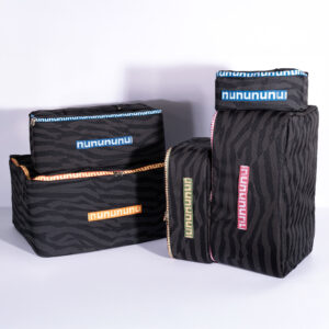
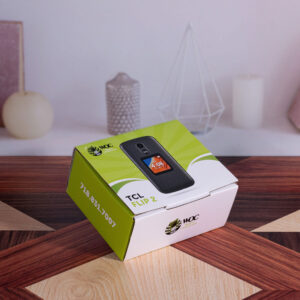
This is where things get wild. These shades are showing up in unexpected places—tech accessories, makeup, even on custom-designed pouches. Perfect for brands wanting to break from minimalism and create visual impact fast.
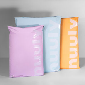
New Neutrals
Core shades: oat milk, putty, dusty blush
The vibe: Understated modern
These neutrals lean warm and soft—less grayscale, more emotion. Great for pairing with bolder accent colors or letting texture and materials take the lead. They’ve been showing up on everything from luxury paper shopping bags to skincare packaging.
Techno Twilight
Core shades: lavender, slate gray, midnight blue
The vibe: Dreamy futurism
Cool, sleek, and just a little otherworldly, this palette shines in high-gloss finishes and holographic treatments. Ideal for packaging in luxury skincare, accessories, or tech—where mood meets modernity.
Solar Pastels
Core shades: peach sorbet, butter yellow, pale coral
The vibe: Light, optimistic
These sunny shades feel fresh and fun. They’re showing up in spring launches and cheerful brand campaigns. Pair with white for a clean look or with terracotta for contrast.
Muted Desert
Core shades: terracotta, clay red, sandy taupe
The vibe: Artisanal and grounded
The earthy palette adds a tactile feel to packaging—perfect for brands focusing on craft, tradition, or natural beauty. Combined with embossed logos or textured materials, these tones create a rich sensory experience.
Combining Shades Like a Pro
The magic isn’t just in the colors—it’s in how they work together. Here’s what designers are doing in 2025:
- Layering tones: Brands are building depth with multiple shades from one family. Think three browns layered from light to dark on a custom euro tote.
- Pairing warm and cool: One of the freshest combos? Warm terracotta with a cool lavender. Unexpected, but striking.
- Color blocking with purpose: Packaging designers are using bold contrasts to emphasize logos or unboxing moments, especially with custom rigid box packaging.
Industry Take: Where These Palettes Are Popping Up
Color palettes don’t exist in a vacuum. In 2025, they’re shaping everything from storefront displays to unboxing moments. Beauty brands are tapping into pastels and creams for their seasonal drops, while luxury retailers are leaning into moody jewel tones across custom jewelry packaging.
Fashion houses are remixing retro oranges and greens in apparel and shopping bag design, while tech brands are embracing lavender and slate in sleek pouch designs and gift boxes. Over in the food and beverage world, brown-on-brown packaging has taken off—with warm creams giving an indulgent edge.
Color in Context: Seasonal and Cultural Influence
Seasons still play a role in color storytelling. Spring/Summer 2025 leans pastel and botanical, while Fall/Winter brings back the browns, blues, and desert tones. What’s more, cultural shifts—like the return of vintage aesthetics and the rise of digital escapism—are driving the direction of these hues.
There’s also an undercurrent of nostalgia running through the palettes this year. Think: modern versions of childhood colors, reimagined through a grown-up lens.
Tips for Brands Using 2025 Color Palettes
Color can be a major asset for any brand—but it has to be intentional. Here are a few tips:
- Choose a core and an accent: Pick one dominant shade, then build around it with complementary or contrasting colors.
- Let packaging lead: Use your palette to elevate the physical experience—like adding a splash of color inside a rigid box or printing with layered tones on a canvas tote.
- Update gradually: If your brand is known for a certain look, slowly introduce trend colors in seasonal lines, campaigns, or accessories.
Color’s Role in Brand Expression
Color isn’t just an add-on. It’s one of the fastest, most effective ways to communicate your identity. The trending color palettes of 2025 aren’t about chasing trends—they’re about telling deeper stories through visual cues.
These shades offer a chance to refresh your brand, spark curiosity, and create a moment that sticks. Whether you lean moody, soft, loud, or somewhere in between, there’s a palette waiting to bring your next product or campaign to life.
Let Your Packaging Pop: Make 2025’s Hottest Colors Work for You
Refresh Your Look with a Custom Color Palette That Hits Every Note
Looking to stand out this season? Let Prime Line Packaging bring your brand to life with color palettes that are current, compelling, and completely ownable. From eye-catching custom gift boxes to premium shopping bags, our team is ready to help you translate 2025’s top color trends into packaging that your customers won’t forget.
Don’t just follow trends—create experiences.