

As we come to a close on 2016, Pantone has been gearing up for the upcoming year with a new list of top ten colors. These trendy hues selected by Pantone are so versatile that they can be used for the start of fall and can continue well into the spring months of 2017.
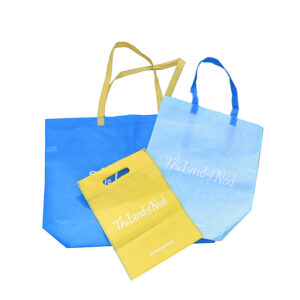
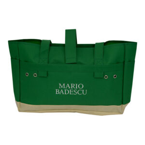
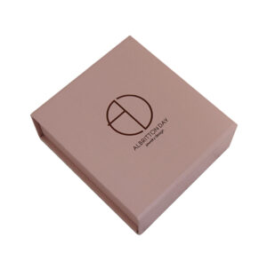
This season, consumers are gravitating towards bright bold shades that can be paired together or used alone. Many of these colors can already be seen in stores as well as used on packaging. These colors convey a sense of earthiness, which play into the mixture of relaxation and the great outdoors, perfect for continuing into 2017.
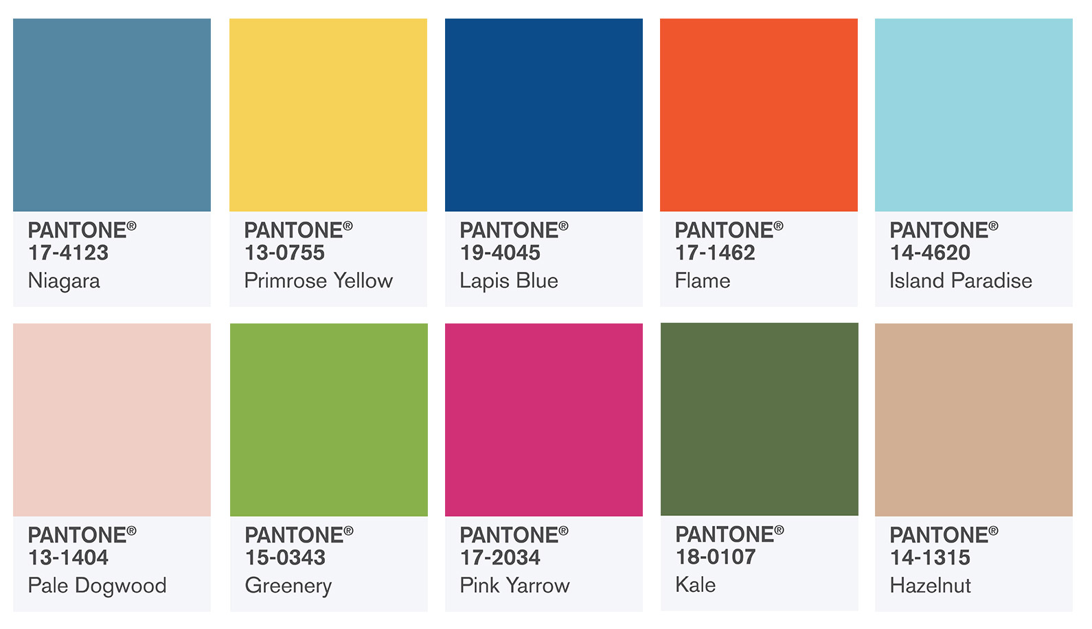
Keeping up with seasonal transitions should not be a hassle. To create packaging that stands out from the rest, combine these hues into an eye-catching piece of art. Below, Pantone has compiled a recommended color palate for the trendy designer.
Niagara: PMS 2149 C
Primrose Yellow: 122 C
Lapis Blue: 7686 C
Island Paradise: 310 C
Pale Dogwood: 4685 C
Flame: 7625 C
Hazelnut: 7590 C
Kale: 2408 C
Pink Yarrow:
Process Magenta C
Greenery: 360 C
Contact our team today to create your own custom packaging


