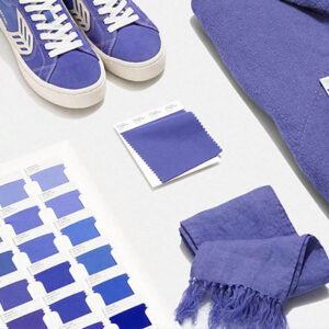
Every year Pantone selects a color that represents the year ahead. For 2022, Pantone chose Very Peri. Pantone describes this new cool hue as “A new Pantone color whose courageous presence encourages personal inventiveness and creativity”. This hue will be prominent throughout the new year. It will spark new inspirational ideas in fashion, home décor, design, cosmetic packaging and of course e-commerce fields.
Very Peri displays carefree confidence and a daring curiosity that animates anyone and everyone’s creative spirit. Inquisitive and intriguing, Very Peri helps us to embrace the unknown future and otherwise altered landscape of possibilities. This hue opens us up to a new vision as we continue to rewrite our lives for the future.
Very Peri is a deep shade reminiscent of Periwinkle. It rekindles gratitude for some of the qualities that the blue family represents. This cool hue complements a new perspective that resonates today. Pantone’s new color of the year, Very Peri helps paint the future ahead in a new light.
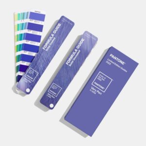
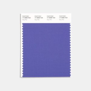
PANTONE 17-3938: Very Peri
We are continuing to live in transformative and occasionally uncertain times. Very Peri (PANTONE 17-3938) can be interpreted as a symbol of the current global outlook. Moreover, this hue represents the transition we are all going through. As we continue to emerge from a period of isolation…some more than others, our notions and standards are constantly changing. As a result, our physical and digital lives have merged in so many new ways.
Digital design helps us stretch the limits of reality. This opens many doors to a dynamic virtual world where we can further explore. Therefore, we can further create new color possibilities. With trends in gaming, for example, its expanding popularity rises in the artistic community and in digital space. Very Peri easily illustrates the fusion of modern life. This newly chosen hue justifies how color trends in the digital world can manifest in the physical world.
First, Pantone explains “As we move into a world of unprecedented change, the selection of Very Peri (PANTONE 17-3938) brings a novel perspective and vision of the trusted and beloved blue color family. Very Peri encompasses the quality of the blue color palette. Yet, at the same time, with its violet red undertone, Very Peri displays a joyous attitude. The dynamic presence of this hue further encourages creativity and imaginative expressions”.
Very Peri: Discovering The Color of the Year 2022
Next, Pantone’s color of the year selection process requires thoughtful consideration and trend analysis. To successfully choose the new year’s color, Pantone’s color experts carefully research the world’s trends. Think pop culture, political and fashion trends for new color influences. Similarly, color trend research includes the entertainment industry, traveling, art, as well as all areas of design.
Color influences may also include technology, materials, textures, and other effects that may impact color. Sporting events and social media platforms that capture worldwide attention have been known to influence Pantone’s color of the year. For 23 years, Pantone’s color of the year heavily influenced product development and purchasing decisions in multiple industries. Most importantly, this includes fashion, home furnishings and industrial design. Product packaging and graphic designers alike are always eager to see Pantone’s annual color selection.
Very Peri
Above all, 2021 has not been our favorite year either. We are all looking for ways to brighten up 2022 with new energy, clarity, and the hopes to overcome any continuing uncertainty. In addition to overcoming uncertainty, choosing Very Peri, represents our ongoing need for calmness in the new year. This cool hue was chosen in the hopes to keep our positive insight, innovation, and intuition to press us forward towards a new way of thinking and concepts.
For more information, visit Pantone’s Color Guide to find out how you can factor in Pantone’s newest color of the year to a wide variety of different color palettes.


