A great way of making your brand more modern is by following the most current packaging trend forecast. Whether you want to simplify your look or make it more vibrant, there will always be a variety of options that will fit in with the current fashions.
The Dieline recently looked through some of the most popular designs it featured and they compiled a list of recurring trends they found that will probably be prevalent throughout 2014. The packaging trend forecast is broken down into the following categories: Kraft is King, Bold Geometry, Clearly White, Hi Contrast, a Wash of Watercolor, White as the Canvas, and Curiosity.
Kraft is King is a trend that focuses on using kraft paper in new and innovative ways. An already versatile material, kraft can be made into a wide array of bags, boxes, envelopes and e-commerce supplies. Brown kraft has a rustic feel to it, and makes your products look earthier. If you want an environmentally friendly paper, but you don’t want the brown showing, flipside kraft is always an option you can use. For a unique look and greener approach to packaging, try this trend for your next project!
Bold Geometry is characterized by very bright and colorful geometric patterns. Stylistically, this trend will draw a lot of attention because it’s very eye-catching. If you prefer something very detailed and colorful in lue of simplistic, this option is a great choice for your packaging!
The Clearly White trend is completely on the other end of the spectrum from Bold Geometry. With white type printed on a clear material, this packaging emphasizes the product inside. If you want your packaging to be more neutral, and instead make the contents the focus of the design, this is one of the best ways to do it!
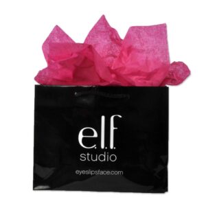
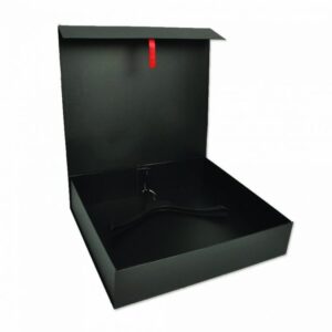
If you want a dramatic package, hi contrast is the trend you need to follow. Black and white elements against each other create a bold look that garners a lot of attention. Always sleek and modern, these designs jump out at customers due to the great contrast of the two colors. If you want a strong look reflective of your bold brand, try out this trend!
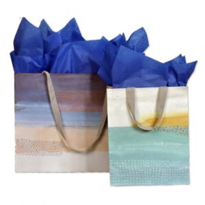
A Wash of Watercolor adds a sense of the artist behind the packaging. Adding handmade elements such as watercolor paint on packaging makes your work feel less designed and more of an artistic expression. Watercolor illustrations and elements feel more personable and create a sense of warmth with your products. If you want to create bright packaging that has more of a man-made feel, this may be the look you want to achieve!
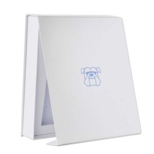
If you’re all about simplicity in your packaging, using white as your Canvas creates a clean, minimal look. A white background and using limited colors in your artwork makes your designs pop, without looking busy. This trend is best if you love minimalist design, but still want a colorful palette.
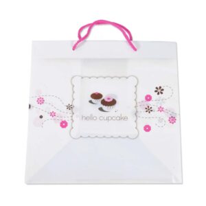
Curiosity shows that design does not have to be serious to be done well. By using illustrations and pastel colors, the focus of this trend is fun and childlike whimsy. If you’re brand has a lighter feel to it, this may be a look you would like to incorporate into your packaging. Using assorted templates, handle and material options from our designer tools page will also help you further envision your unique packaging design.
No matter what your brand conveys, there is a type of packaging trend forecast that can be suitable to complete your look, whether it’s: typography driven, brightly colored, simplistic, geometric, bold or whimsical! Contact us at Prime Line Packaging with your ideas, and we’ll do our best to make your packaging feel true to your brand with our unlimited customization options.


