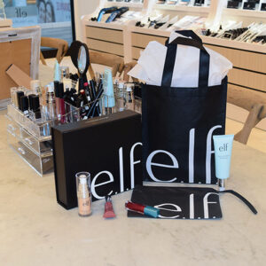

To create target audiences, retailers are all about creating brand identities and incorporating certain themes, color schemes or treatments to create unique minimalist packaging. Many retailers incorporate the black and white trend into their new and existing creative packaging designs for a seamlessly versatile look.
Black and white is a trend that never goes out of style. The use of black and white was popular in recent years and we’re excited to see this color scheme again on minimalist packaging collections in 2018. Black and white color schemes can easily be incorporated into simple designs for companies with a simple yet chic brand identity.
For chic and stylish retailers, incorporating the black and white trend along with adding simple symbols, logos and designs to their minimalist packaging can create a collection that will keep up with a society that is always on the go.
With simplistic logos and symbols, your customers will easily be able to see what your product is all about. Even adding subtle treatments such as embossing, debossing or spot uv will add a creative touch without taking away from the simplicity of the design. Customers love seeing minimalist packaging with the classic look of black and white.


